










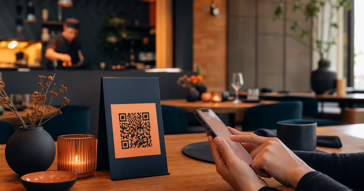
A QR menu layout for restaurant service should do one job exceptionally well: help a guest find what is available now and decide without unnecessary searching. For a small restaurant or café with a changing menu, that means prioritising the choices people make first, keeping categories easy to scan on a phone, and treating availability as part of the menu structure rather than a last-minute note.
A printed menu can make changes cumbersome. A digital menu behind a QR code gives you a practical way to keep dishes, prices and availability current without reprinting. The value, however, depends on how the menu is organised. If the mobile layout is unclear, a current menu can still feel difficult to use. A good structure makes the changing parts of your offer understandable at a glance.
Start with the choices customers look for first
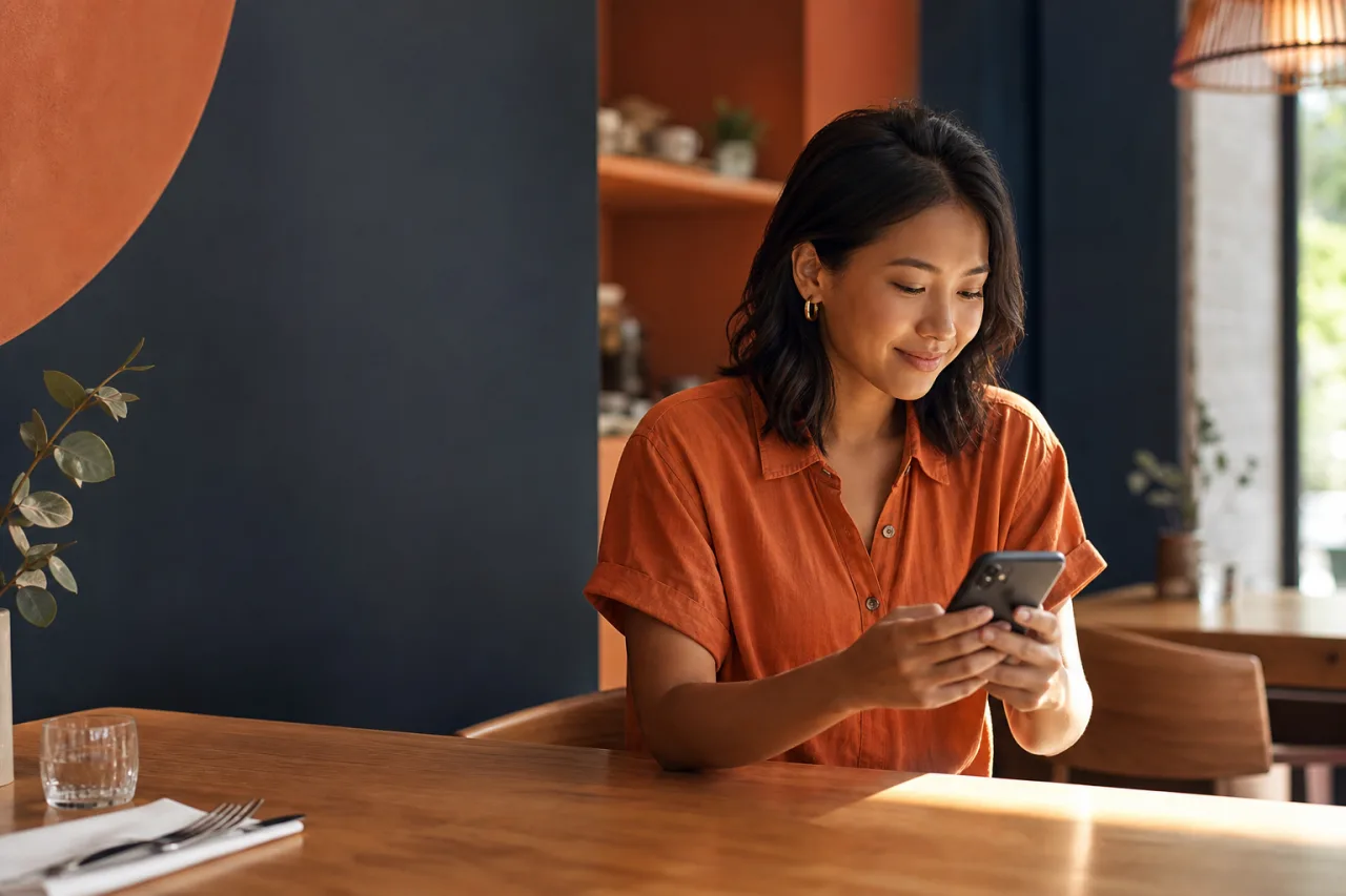
Think about the moment a guest opens the QR code. They are usually not looking for an overview of everything you serve. They want to answer a few immediate questions: What can I order? What kind of dish do I want? Is the item I came for available? What does it cost?
Your opening view and first categories should support those questions. Put the most commonly ordered or most decision-relevant parts of the menu where customers can reach them quickly. In a small restaurant, this often means leading with the active food offer rather than making guests pass through background information before they can see dishes.
Use names that match the way guests ask for food. A category called Small Plates is more direct than a creative label that needs explanation. Mains, Sides, Desserts and Drinks are easy to understand on a small screen. If your menu operates around a particular service, that service can also be a useful first choice, provided it reflects what is genuinely available.
The best mobile menu layout does not make every item equally prominent. It makes the next customer decision easy.
Keep the first level of navigation short. Too many top-level categories force guests to compare labels before they can compare dishes. If a category contains only one or two items for long periods, consider whether those items belong in a more natural existing group. Conversely, if a category has become long, split it only when the split gives customers a clear reason to choose one section over another.
Group dishes into clear mobile categories
Mobile restaurant menu design is less forgiving than a large printed page. Customers see one part of the menu at a time, so each category needs a clear purpose. Grouping dishes by the course, type of item, or service period can work well because these are familiar routes to a choice.
Choose one organising principle at a time
Confusion often begins when categories mix different principles. For example, a menu that combines Lunch, Pasta, Chef's Favourites and Vegetarian at the same level asks customers to guess where an item belongs. Some labels describe time, some describe dish type, and some describe a characteristic. The result can be duplicate listings or missed items.
For a changing menu, start with the principle your guests use most reliably:
- Course-based categories suit menus where guests choose a meal in stages, such as starters, mains and desserts.
- Item-type categories suit focused offers, such as sandwiches, bowls, pastries or coffee.
- Service-based categories suit businesses with distinct breakfast, lunch and all-day offers.
You do not need to make every possible route a top-level category. Pick the clearest primary route, then use dish names and descriptions to make individual choices understandable. This keeps navigation compact and helps staff maintain the menu as dishes change.
For more guidance on arranging sections around different service periods, read how to plan QR menu categories for breakfast, lunch and all-day service. The important point is to use dayparts only when they make the current offer easier to understand. If the same dishes are available throughout the day, course or item-type categories may be simpler.
Keep category names stable when dishes change
Changing dishes do not require changing the navigation every time. Stable categories give returning guests a familiar path and make the menu easier to check. You can rotate dishes within Seasonal Mains, for example, while keeping the category itself consistent.
This is particularly useful for specials. Instead of creating a new category for every short-lived item, place a special in the category where a guest would naturally look for it. A soup belongs with starters or light dishes; a new cake belongs with desserts. Create a dedicated specials category only if guests regularly look for specials first and you can keep that section current.
As you organise QR menu content, avoid repeating the same dish in several categories unless there is a strong practical reason. Repetition can lead to mismatched prices, descriptions or availability after an update. One clear home for each dish makes maintenance more dependable.
Make unavailable items unambiguous
Availability is not a minor detail for a changing menu. It directly affects the guest experience. If an item is unavailable, customers should be able to recognise that before they decide to order it. An unclear menu leaves guests disappointed and can create extra conversations for staff during busy periods.
Choose a consistent approach. When a dish is not available, mark it clearly as unavailable or remove it from the active menu, depending on what best fits your service. The key is that a guest should never have to infer whether an item can be ordered.
Use clear, plain language. Avoid vague wording that might suggest an item is temporarily delayed, optional or still orderable. If you keep an unavailable dish visible because it will return soon, make the status obvious where the item is listed. If you remove it, check that it is not still referenced in another category.
Availability should also shape your category decisions. A section with no active dishes can create a dead end on a phone. During a significant menu change, review the category itself as well as the individual items. If an entire section is temporarily empty, consider whether it should remain visible for that period.
A digital menu can make this routine easier because you can update dishes, prices and availability without reprinting menus. QR Menu is designed to publish a clear digital menu behind a QR code, giving small restaurants and cafés a practical workspace for keeping the customer-facing menu aligned with the current offer.
Review the menu after each significant change
A well-organised menu is not finished once it is published. Every meaningful change is an opportunity to check whether customers can still scan it easily. This does not require a full redesign. A short review after a new dish, removed item, price change or service change can prevent small inconsistencies from accumulating.
Use a simple mobile review routine
- Open the menu on a phone. Look at it as a guest would, starting from the first screen rather than from your editing view.
- Check the first choices. Can a guest quickly reach the food or drinks they are most likely to want now?
- Check each changed item. Confirm its name, category, price and availability are all current.
- Check category balance. Look for sections that are empty, overly long or no longer meaningful after the change.
- Check for duplicates and leftovers. Make sure removed items, old prices and outdated category references do not remain elsewhere.
This routine is especially helpful when the menu changes mid-service. It keeps the operational task focused on the information a customer actually sees: the right dish, in the right place, with a clear current status.
If your menu is short, resist the temptation to add complexity simply because a digital menu can hold more sections. A smaller menu benefits from a smaller decision path. If it is growing, add structure gradually and only where it reduces scanning effort. The goal is not to create the most detailed menu map; it is to help customers reach a confident choice.
Build around clarity, then keep it current
The right QR menu layout for restaurant service begins with customer decisions. Lead with what guests seek first, use a small number of plain-language categories, give every dish one natural home, and make unavailable items unmistakable. Then review the mobile experience whenever the offer changes.
With QR Menu for restaurants and cafés, you can publish a mobile-friendly menu behind a QR code and change dishes, prices and availability as needed. Organise your menu around how customers scan and choose dishes, then keep each update clear enough for guests to order with confidence.