










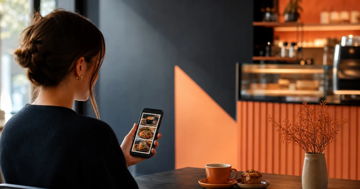
A mobile café menu is often read in a short pause: while a customer is approaching the counter, choosing a table, or deciding between a familiar drink and something new. In that moment, the menu does not need to say everything at once. It needs to make the next decision easy.
For café owners and managers, this means treating menu structure as part of the customer experience. Clear groups, recognisable item names, visible prices and current availability help people move from scanning to choosing without unnecessary searching. A well-organised mobile menu can also make the café’s offer feel calmer and easier to understand, even when the range includes drinks, food and changing daily options.
This guide explains how to structure a mobile café menu around the way customers read on a phone. The goal is not to make the menu longer or more decorative. It is to make every important choice easier to find.
Start with the customer’s first decision
Before arranging individual dishes, consider what a customer is most likely to look for first. In many cafés, the first question is simple: coffee, another drink, breakfast, lunch, or something sweet? A mobile menu should answer that question quickly with a short, understandable set of top-level sections.
Start with the major parts of your offer rather than internal kitchen logic. For example, customers may understand sections such as Coffee, Tea and other drinks, Breakfast, Lunch and Pastries immediately. A label that is clear at a glance is more useful than one that requires explanation.
Put the sections most relevant to your café’s usual order flow near the beginning. If espresso drinks are your central offer, they should not be buried beneath a long list of food. If your café is known for a lunch selection, make that route equally obvious. The right order reflects what customers are most likely to seek, not the order in which the team prepares items.
A customer should be able to identify the right section before they need to read individual item descriptions.
Keep the first level of navigation focused. Too many broad sections can make a small menu feel complicated, while a single all-purpose list makes customers scroll and compare unrelated items. Choose only the divisions that help customers make a real first decision.
Group dishes and drinks clearly
Once the main sections are established, group related items in a consistent way. The purpose is to help customers compare like with like. A person choosing between cappuccino, latte and flat white should see those options together. Someone looking for a sandwich should not need to pass through pastries and cold drinks first.
Use familiar category names
Plain labels reduce effort. Name a category for what the customer can find inside it, such as Cold drinks or Sandwiches. If a house name is important to your café, it can sit alongside a clear label, but it should not replace clarity. The same principle applies to item names: lead with the recognisable name, then add a short detail where it helps distinguish the choice.
Create subgroups only when they solve a problem
A large drinks section may benefit from smaller groups such as espresso drinks, iced coffee and non-coffee drinks. A food section may separate savoury dishes from sweet dishes. But subgroups should make scanning easier, not turn the menu into a hierarchy customers must decode.
Use them when a customer would otherwise need to scan a long list to find a type of item. Avoid them when there are only a few entries and one straightforward list is easier to read. Consistency matters as well: if drinks use meaningful subgroups, organise other large sections with the same level of care.
Keep item information in a repeatable order
Within each section, present information in the same sequence. A useful pattern is item name first, a brief description second when needed, and price in a predictable position. Repetition helps the reader learn the layout after the first few items. They can then focus on the choice itself rather than working out where each detail is located.
Descriptions should earn their place. Use them to explain an unfamiliar item, distinguish a variation or identify the main components of a dish. If an item is already self-explanatory, extra text can slow down a mobile reader. In a compact mobile restaurant menu layout, short, useful wording is easier to scan than promotional language around every choice.
Keep prices and availability visible
Prices are part of the decision, not an afterthought. Place each price close to its item and use a consistent format throughout the menu. Customers should not have to open a separate area, scroll to the end of a section or guess which price belongs to which dish.
Clear pricing also supports comparison. When similar drinks or dishes are grouped together and their prices are easy to locate, customers can decide with confidence. Do not interrupt that comparison with unrelated items or uneven formatting.
Availability deserves the same attention. A mobile menu loses usefulness when it displays items that cannot currently be ordered without making that clear. If a dish, drink or daily option is unavailable, show that status accurately or remove it from the active choice. When an item becomes available again, restore it in the same logical place so regular customers can find it.
This is one practical reason to use a digital menu rather than rely only on printed copies. QR Menu for cafés lets you publish a menu behind a QR code and change dishes, prices and availability without reprinting menus. Keeping the live menu aligned with what the café can offer helps the structure remain trustworthy.
Avoid unnecessary menu clutter
Mobile screens reward restraint. Every extra heading, repeated explanation or isolated special message competes with the customer’s main task: selecting something to order. Clutter does not only mean a large number of items. It can also mean too many labels, long descriptions, inconsistent names or special formatting that appears everywhere.
Review each part of the menu with one question: does this help a customer choose? If it does, keep it concise and place it where it is needed. If it does not, consider removing it. This approach is especially useful for café menus that have grown gradually through seasonal additions, daily specials or renamed items.
- Limit category overlap. An item should have one obvious home whenever possible.
- Use a single naming style. Avoid switching between short names, full sentences and internal product labels.
- Keep descriptions brief. Explain meaningful differences rather than repeating what the item name already says.
- Separate changing choices thoughtfully. Daily options should be easy to spot without disrupting permanent categories.
- Remove outdated entries. A current, focused menu is easier to use than a complete record of past offers.
Clarity is not about making the menu impersonal. A café can still show its character through thoughtful names and a curated offer. The key is to make that character easy to understand on a phone, rather than requiring customers to read through a dense page before they can order.
Design the order of information for a phone screen
Customers usually scan a mobile menu from top to bottom. Put the most useful information before supporting detail. A clear section title should come before the item list; an item name should come before an optional explanation; price should remain immediately visible with the item.
Consider the scroll path as well. If a category is very long, the best-known or most frequently chosen items can appear first, followed by additional choices. This does not mean hiding the rest of the menu. It means helping a customer reach a likely decision without working through an unstructured sequence.
Make variations easy to interpret. Where size, temperature or another choice changes the item, present that relationship clearly and consistently. Do not make customers jump between distant sections to understand what they can order. A simple, repeated pattern is more comfortable than a different arrangement for every item.
When you need a practical place to maintain this organisation, a digital QR menu from QR Menu provides an accessible workspace for publishing the menu customers open on their phones. The useful part is not the code by itself; it is having one current menu structure that can reflect your dishes, prices and availability.
Test the menu on a phone before customers do
A menu can look orderly while being edited and still feel difficult when read on a small screen. Testing is how you catch that gap. Open the published menu on a phone and act as if you are a first-time visitor. Try to find a coffee, a food item, a price and an unavailable option without relying on prior knowledge.
- Check whether the opening sections make sense within a few seconds.
- Choose one item from each major section and see whether its price is immediately clear.
- Look for labels that only make sense to the team and rewrite them for customers.
- Scan for duplicated categories, repeated items and long blocks of text.
- Confirm that current availability is reflected before sharing the menu.
Repeat this review whenever the offer changes significantly. Small adjustments can have a large effect on QR menu usability: moving an item into a clearer group, shortening a description or updating an unavailable dish can remove a point of hesitation for every customer who opens the menu.
You can publish and maintain that customer-facing version with QR Menu, which is designed to let restaurants and cafés update dishes, prices and availability without reprinting menus.
Conclusion: make the next choice obvious

The strongest mobile café menu is organised around quick, comfortable decisions. Begin with familiar sections, group comparable items together, keep prices and availability visible, remove clutter and test the real menu on a phone. These steps make the menu easier to scan without requiring customers to install anything or learn a complicated layout.
Use QR Menu to publish a clear menu that customers can open on their phones. Start with a focused structure, keep it current, and give every customer a simpler path from scanning to ordering.